2024 Paint Colors of The Year
In 2022 we saw green dominate the colors of the year, and in 2023 muted colors were all the rage. 2024 seems to be a mixed bag– there are colors of the year all across a wide spectrum. If we had to pick a theme for 2024 it would be versatility– there are amazing colors to create whatever look and feel you are going for, so pick the best one for your space! We hope this guide to the 2024 colors of the year is helpful, whether you are looking to refresh your restaurant, office, or any other type of commercial space.
Why Are Paint Colors Important?
Imagine you walk into a med-spa for a relaxing massage and you are greeted by neon green and yellow walls– would you feel a sense of calm, or a jarring feeling? The wrong color could be sending a confusing or distracting message to visitors. It may also stress out employees that are present in that environment for eight-plus hours per day. Whereas, a color that matches the brand and environment a company wants to convey can do the exact opposite and create a harmonious experience for customers and employees.

Sherwin-Williams: Upward
Sherwin-Williams color of the year pick for 2024, Upward, is a color they describe as breezy and blissful. It should pair well with neutrals, deep shades of green or blue, and even black. Upward might be a good color choice for your space if you are looking to increase the positive energy in your space.
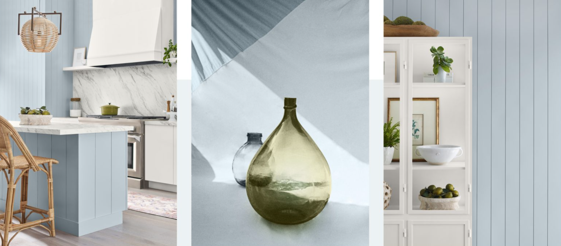
Photo via https://www.sherwin-williams.com
Behr: Cracked Pepper
Behr’s 2024 color of the year, Cracked Pepper, is a versatile soft black. This color can be used as a background in your space to elevate and accentuate all of the elements around it.
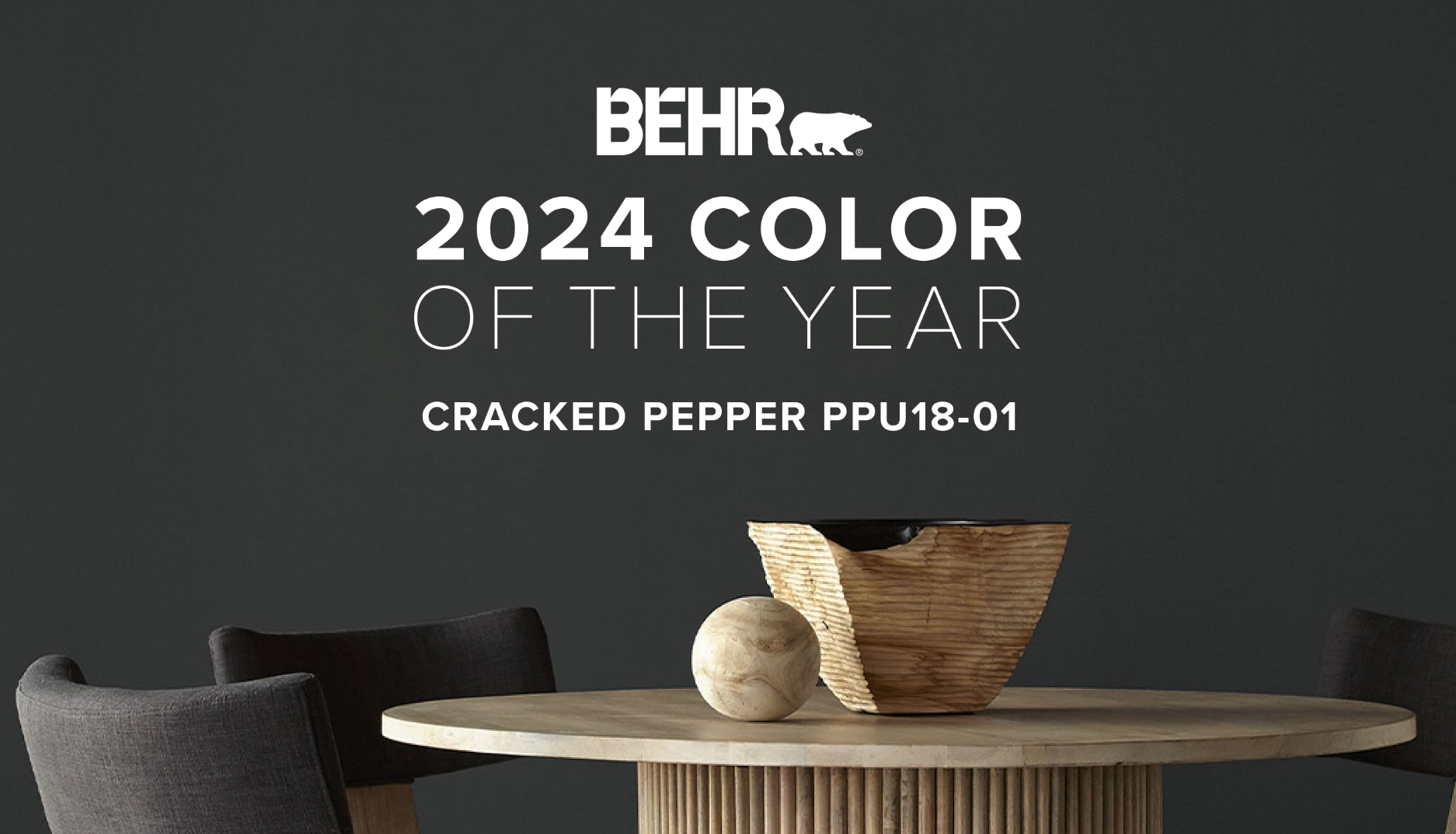
Photo via https://www.behr.com/
Sherwin-Williams HGTV (Lowes): Persimmon (+Renewed Comfort Collection)
For 2024, Sherwin-Willams HGTV has selected 10 colors that make up their Renewed Comfort Collection. This collection contains a variety of hues that offers versatile options for whatever feeling you are trying to evoke in your space. Sherwin Williams HGTV has designated Persimmon as their official color of the year. Their website states that Persimmon is an earthy shade that imparts an uplifting and refreshing feeling. This color could be incorporated into a space to soften it and add a feeling of comfortable elegance.
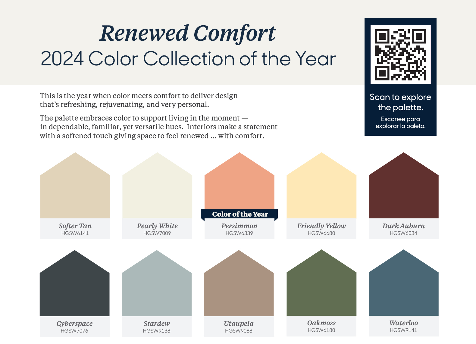
Photo via https://www.hgtvhomebysherwinwilliams.com/content/dam/cbg-hgsw/design-help/color-collections/coty-24/HGSW-2024-Color-Collection-of-the-Year-Brochure.pdf
PPG / Glidden: Limitless (+Trending Colors)
For 2024 PPG and Glidden present what they consider to be the trending colors, which consist of a new spin on familiar warm tones. They also chose Limitless as its color of the year. Limitless is fresh, warm hue of yellow, which can function as a supporting neutral or stand on its own.
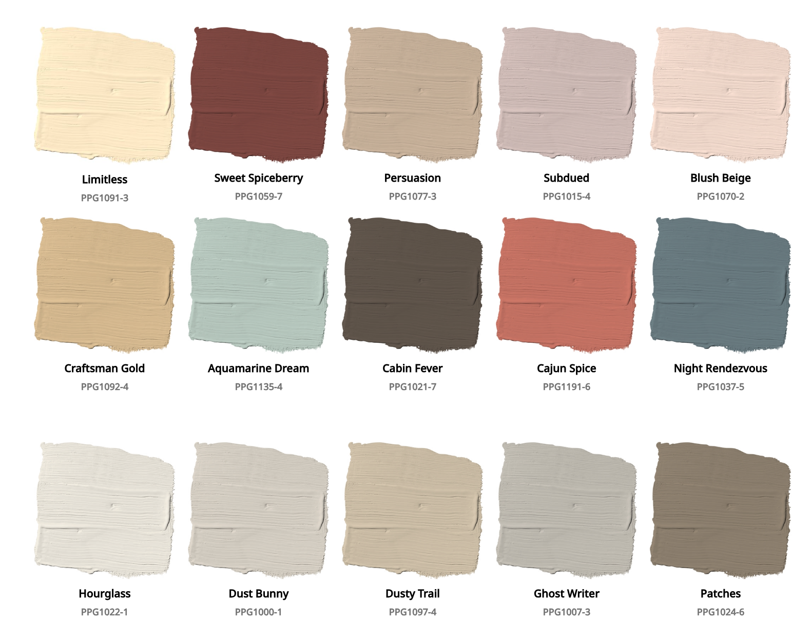
Photo via https://www.glidden.com
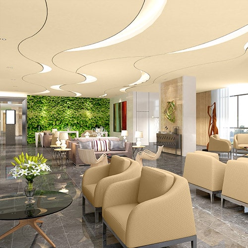
Photo via https://www.ppgpaints.com
Benjamin Moore: Blue Nova
Benjamin Moore‘s 2024 color of the year is Blue Nova. Regarding Blue Nova, they say: “Violet and blue come together in this elevated, sumptuous hue. This alluring mid-tone features an enchanting duality, capturing the spotlight with endlessly classic appeal.”

Photo via https://www.benjaminmoore.com
Valspar- Renew Blue
Valspar’s 2024 color of the year is Renew Blue, a green-influenced blue that lends a sense of peace to the space where you use it. It pairs well with mid-toned neutrals.
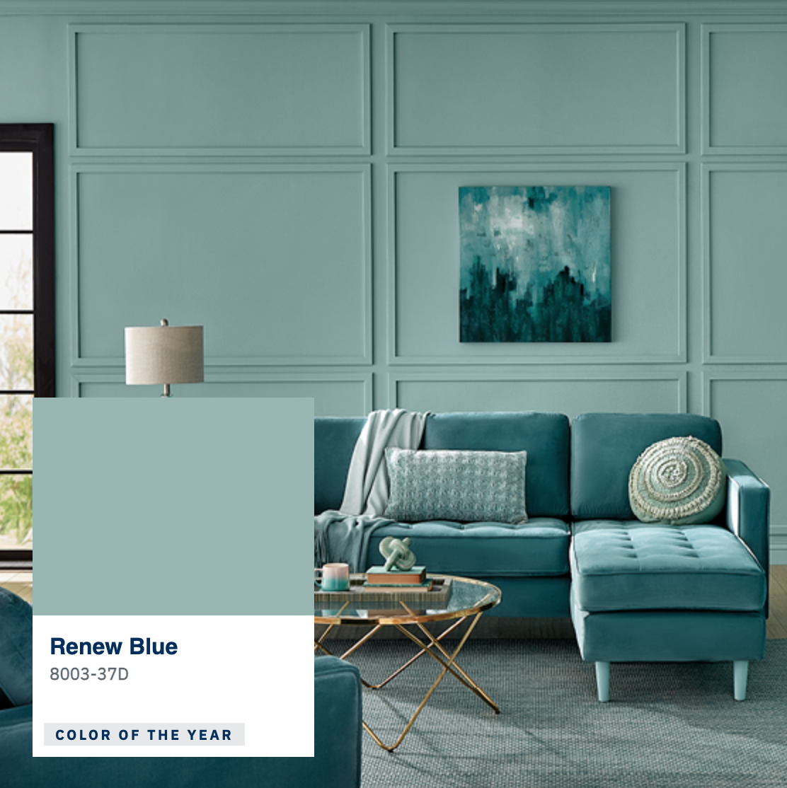
Photo via https://www.valspar.com
Tips For Choosing Colors For Your Space
- Align color choices with marketing goals. While neutral paint helps draw in professional clientele, more colorful choices can help attract younger customers.
- Consider your brand colors, your overall décor, and identify colors that pair well with your logo, furniture, and flooring.
- If you need low maintenance colors that are forgiving of scuffs/fingerprints, choose darker tones in a satin finish and avoid high-gloss, light paints.
- Use a color wheel to find complimentary colors and also consider tints of those two colors.
- Choose your color(s) based on the actions/moods you want to elicit
- Using The 60-30-10 rule that calls for 60% of a room being the dominant color, 30% as the secondary color, and 10% as the accent color.
- Factor in your location/region. Certain districts like historical areas may have color requirements.
- Base colors on the type of business:
- In a medical or dental office, you probably want to choose peaceful colors like neutrals or blues rather than using colors such as yellow and red which might cause patients to feel nervous/upset.
- It is common to use vibrant colors in food and retail shops because they may help evoke a selling response. Consider what you are selling and match colors tones to your product.

Conclusion
Emerald Inc. can assist you in creating a custom space that is unique and memorable, one that will keep visitors coming back, and creates feelings of contentment in employees. We’ll meet with you to discuss what type of atmosphere you want your space to have and how to make it the most successful. Email us today or call us at 480-832-9808 to start designing your space and get an idea of what your construction costs will be.
