2022 Paint Colors of the Year
Paint is one of the most effective ways to quickly give your space a refresh. So, what better way is there to start thinking about how you can give your space a color boost in the new year than by checking out the annual “colors of the year”? In 2021, we saw muted colors dominate. The trend carries over into 2022, with an obvious emphasis on green. While it appears that this year may be remembered as the “year of green”, there are some other great, non-grassy color tones to watch out for.
Why Are Paint Colors Important?
Imagine you walk into a med-spa for a relaxing massage and you are greeted by neon green and yellow walls– would you feel a sense of calm, or a jarring feeling? The wrong color could be sending a confusing or distracting message to visitors. It may also stress out employees that are present in that environment for eight-plus hours per day. Whereas, a color that matches the brand and environment a company wants to convey can do the exact opposite and create a harmonious experience for customers and employees.
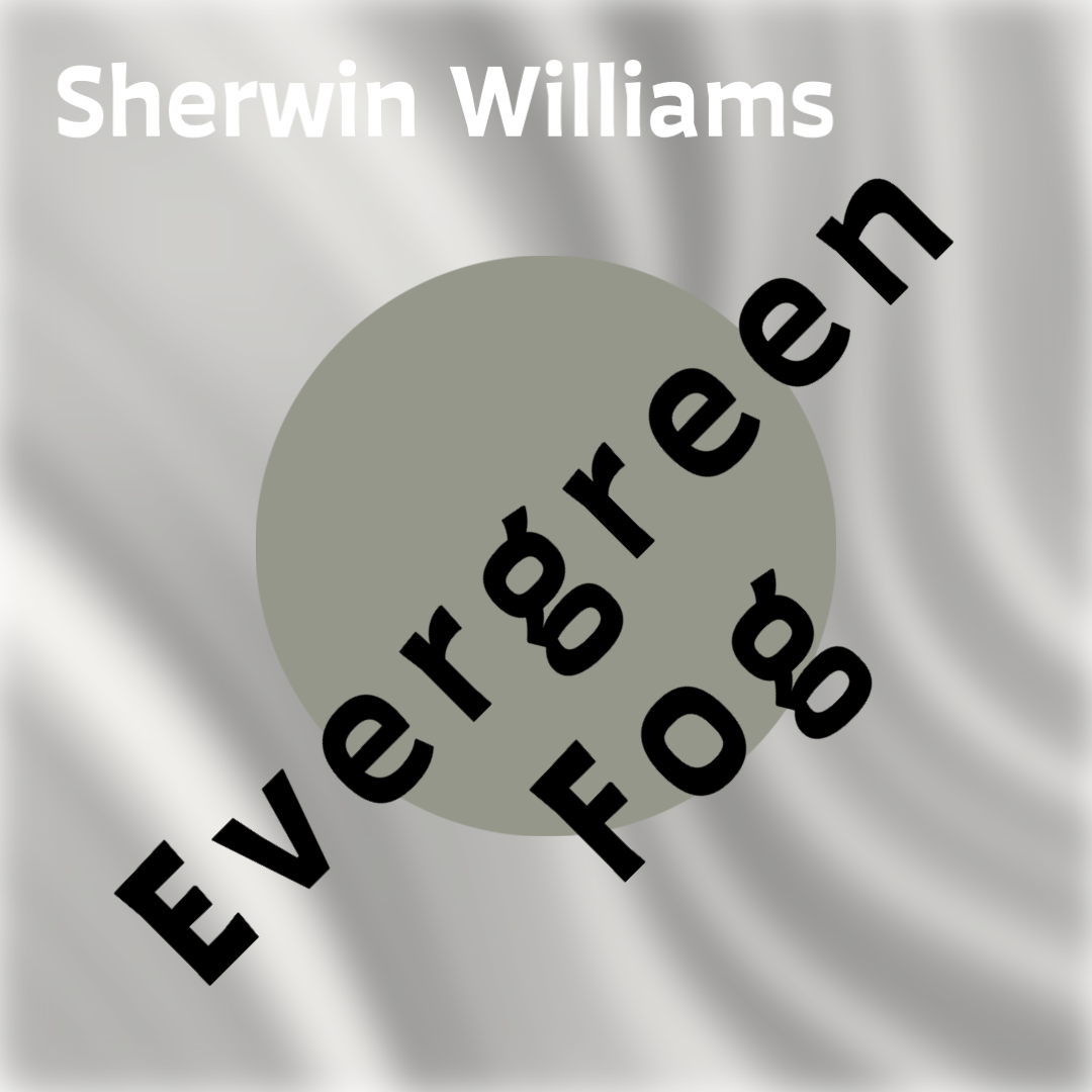
Sherwin Williams: Evergreen Fog
We kick off the “year of green” with a pick from Sherwin Williams that is more gray/muted than the other greens we will see. This might not be surprising, considering that last year’s pick was very neutral as well. Sue Wadden, director of color marketing at Sherwin-Williams, suggests pairing the color with earthy neutrals and said that evergreen fog is a sophisticated choice “for spaces that crave a subtle yet stunning statement shade”
Behr: Breezeway
Behr’s 2022 color of the year, Breezeway, is a silvery blue-green. This color is versatile because, depending on what you pair it with, you can accent its ability to inspire tranquility, or its crisp brightness and energy.

Sherwin Williams HGTV (Lowes): Aleutian
While blue tones were more popular picks last year, Aleutian is one of the few blue tones we are seeing for colors of the year in 2022. It is a gorgeous washed-out blue that creates a sense of comfort and calmness. Because of its warm undertone, it pairs well with neutrals and natural tones.

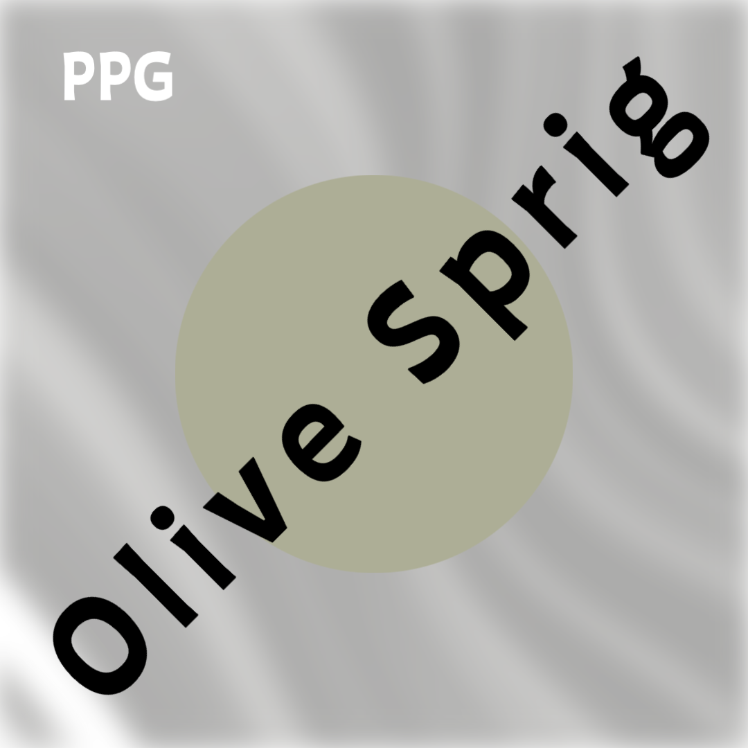
PPG: Olive Sprig
Olive sprig is an organic, sage-like green that evokes a natural feeling of growth and optimism. Pair it with natural materials and textures and you will create a space that soothes and encourages focus.
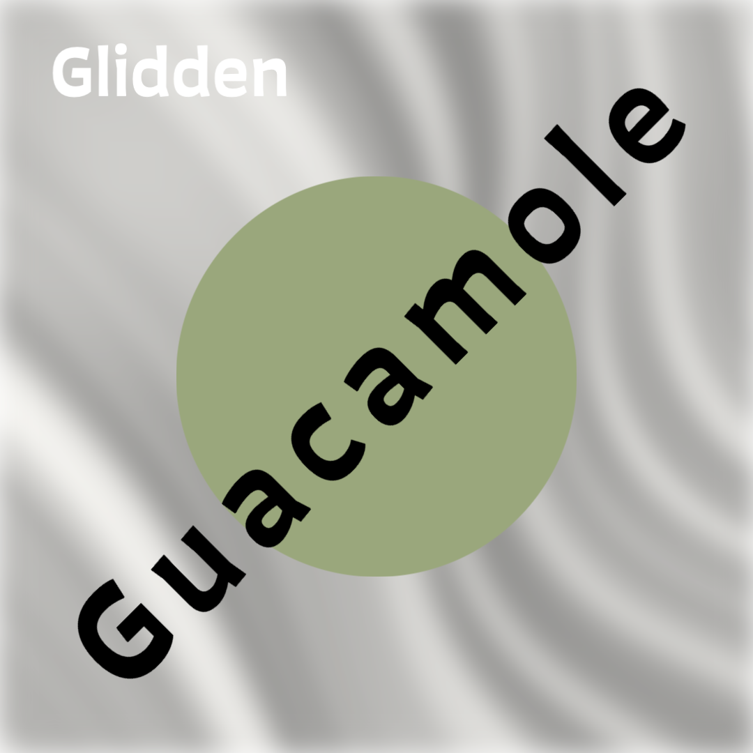
Glidden: Guacamole
Glidden’s Guacamole may be the brightest of the greens this year. With its relaxing and refreshing vibe, this ripe avocado green is sure to be just as crowd pleasing as real guac!
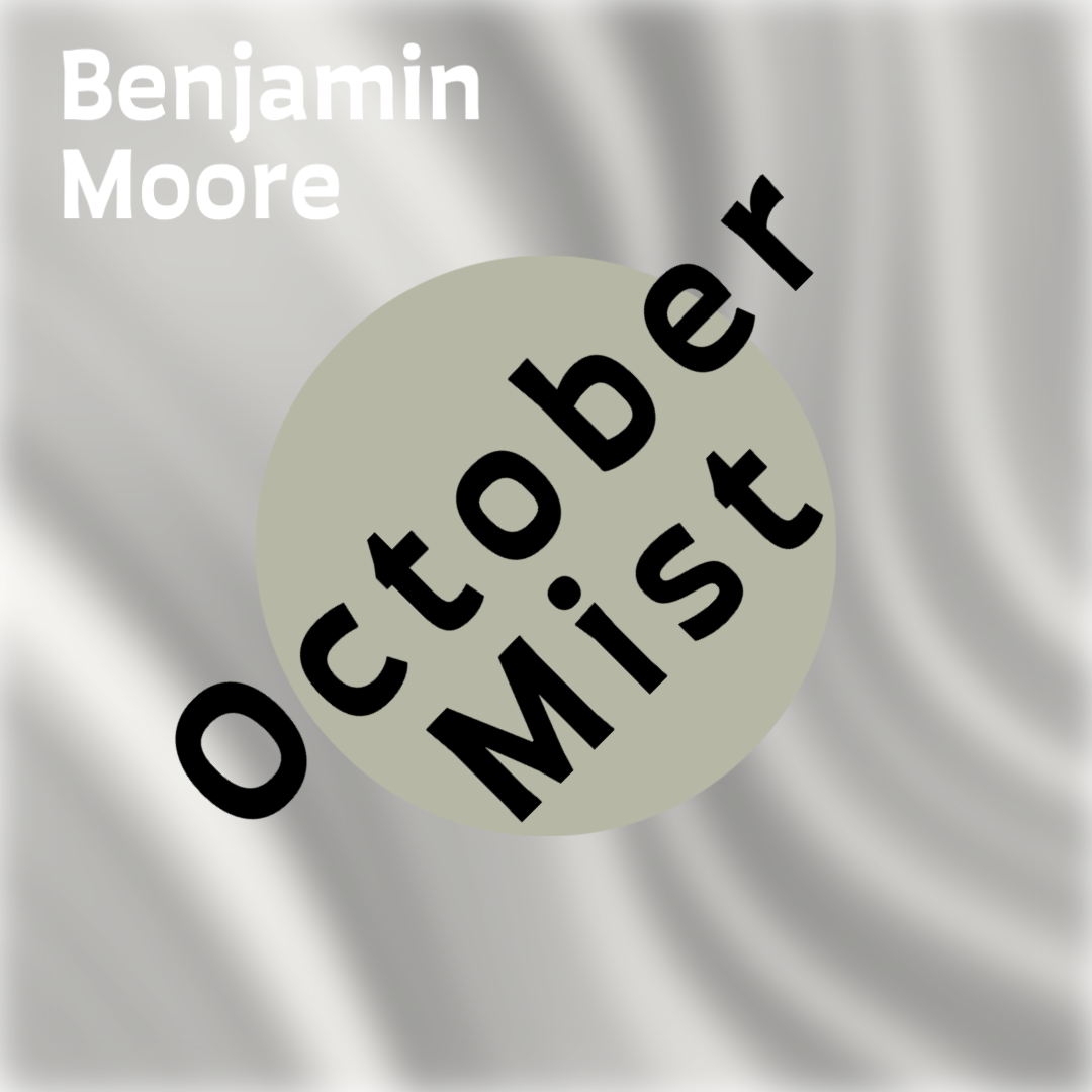
Benjamin Moore: October Mist
Benjamin Moore’s color of the year is yet another shade of green. According to benjaminmoore.com, October Mist is “evocative of the stem of a flower, this gently shaded sage anchors and uplifts”.
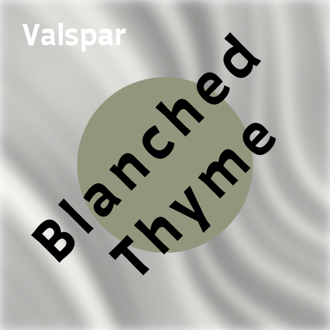
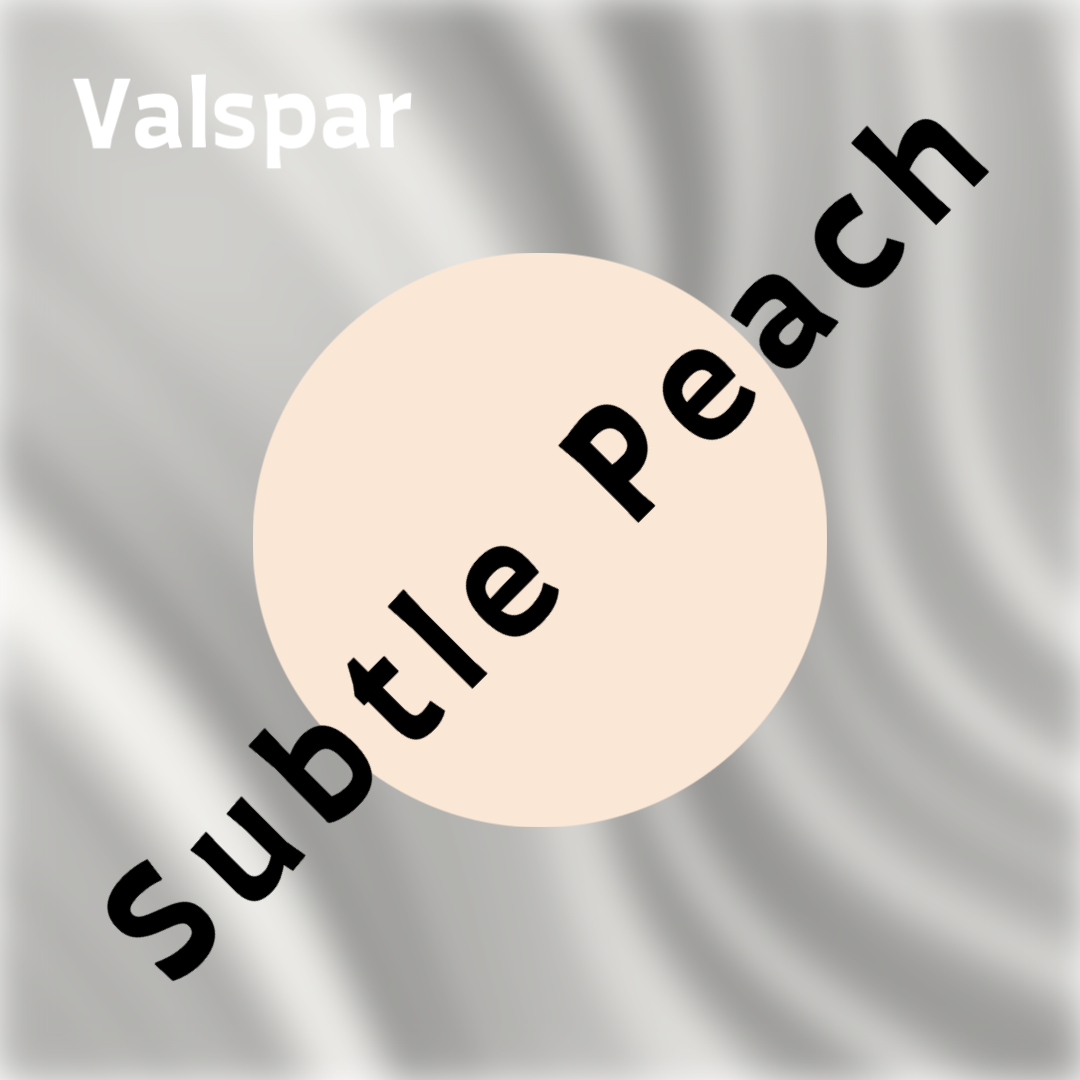
Valspar
Valspar, rather than choose just one color, recommends multiple hues each year for their colors of the year. It’s no surprise that they included a green tone this year, along with several other beautiful picks.


Tips For Choosing Colors For Your Space
- Align color choices with marketing goals. While neutral paint helps draw in professional clientele, more colorful choices can help attract younger customers.
- Consider your brand colors, your overall décor, and identify colors that pair well with your logo, furniture, and flooring.
- If you need low maintenance colors that are forgiving of scuffs/fingerprints, choose darker tones in a satin finish and avoid high-gloss, light paints.
- Use a color wheel to find complimentary colors and also consider tints of those two colors.
- Choose your color(s) based on the actions/moods you want to elicit
- Using The 60-30-10 rule that calls for 60% of a room being the dominant color, 30% as the secondary color, and 10% as the accent color.
- Factor in your location/region. Certain districts like historical areas may have color requirements.
- Base colors on the type of business:
- In a medical or dental office, you probably want to choose peaceful colors like neutrals or blues rather than using colors such as yellow and red which might cause patients to feel nervous/upset.
- It is common to use vibrant colors in food and retail shops because they may help evoke a selling response. Consider what you are selling and match colors tones to your product.

Conclusion
Emerald Inc. can assist you in creating a custom space that is unique and memorable, one that will keep visitors coming back, and creates feelings of contentment in employees. We’ll meet with you to discuss what type of atmosphere you want your space to have and how to make it the most successful. Email us today or call us at 480-832-9808 to start designing your space and get an idea of what your construction costs will be.
Sources
.https://www.bhg.com/decorating/color/paint/2022-color-of-the-year/
