2026 Paint Colors of the Year for Commercial Spaces (Arizona Guide)
Every October, the biggest paint brands release their “Color of the Year,” offering a glimpse into where design trends are headed. For Arizona business owners planning a tenant improvement (TI) project or commercial remodel, these annual picks can help inspire a fresh, modern look that aligns with your brand, enhances customer experience, and supports employee well-being.
For 2026, one trend is unmistakable: Commercial spaces are moving toward grounded, restorative colors that create calm, stability, and sophistication.
Warm neutrals, earthy greens, tailored charcoals, and richly balanced reds dominate this year’s palettes — a welcome shift for businesses designing timeless, professional environments.
Below is your complete guide to the 2026 Paint Colors of the Year, what they mean, and how Arizona businesses can use them in offices, retail spaces, medical facilities, restaurants, and more.
Why Paint Color Matters in Commercial Environments
Paint color isn’t just a design choice — it influences how customers feel, how productive employees are, and how well your brand communicates its message. In a commercial TI project, color decisions impact:
-
Customer perception
Calm neutrals convey trust. Vibrant, intentional colors spark energy or appetite. -
Employee experience
Restorative hues reduce stress and improve focus. -
Brand identity
Color can reinforce professionalism, luxury, wellness, innovation, or warmth. -
Long-term maintenance
Some shades hide scuffs better, crucial for high-traffic spaces.
Choosing a trend-informed but timeless palette helps your business stand out — without needing constant repainting every few years.
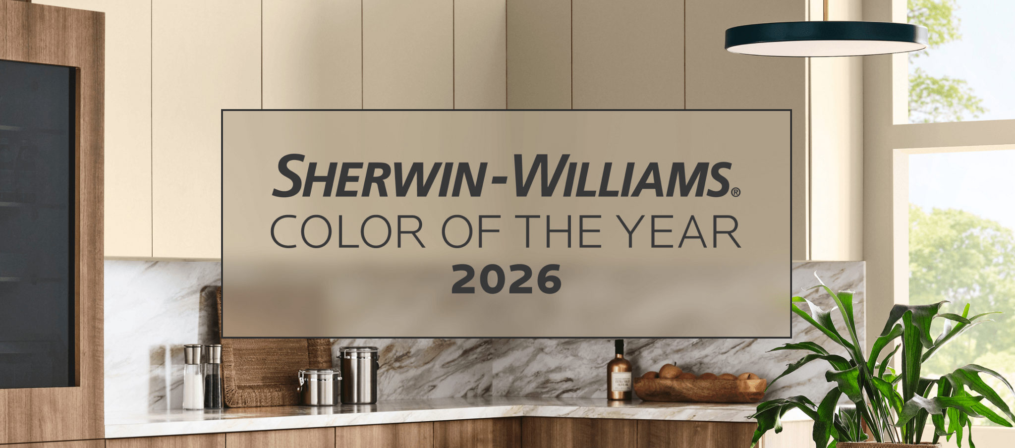
Sherwin-Williams 2026 Color of the Year: Universal Khaki (SW 6150)
Tailored & Timeless
Sherwin-Williams sets the tone for 2026 with Universal Khaki, a warm, earthy neutral chosen for its “balance of livability and longevity.”
Why It Works in Commercial Spaces
-
Extremely versatile for TI projects
-
Matches natural finishes like stone, wood, and bronze
-
Works with modern minimalist interiors or more traditional builds
-
Ideal as a whole-space wall color for offices, hospitality, and medical spaces
Best Uses for Arizona Businesses
-
Professional offices seeking a clean, modern baseline
-
Medical & dental clinics wanting calm, stress-reducing warmth
-
Retail stores pairing it with bold brand accents
-
Restaurant dining rooms aiming for earthy, welcoming tones
Emerald Inc.’s Tip: Combine Universal Khaki with black metal accents, white trim, or greenery to create a refined yet grounded aesthetic.
Behr 2026 Color of the Year: Hidden Gem (N430-6A)
Smoky Jade Sophistication
Behr’s Hidden Gem is a smoky jade with subtle depth — dramatic enough to make a statement, yet soft enough for professional interiors.

Why It Works in Commercial Spaces
-
Luxurious and modern
-
Adds richness without overwhelming
-
Ideal for accent walls or cabinetry
-
Perfect for “color drenching” focal areas
Best Uses
-
Boutique retail looking for a polished, upscale feel
-
Cafés or wine bars wanting cozy, moody interiors
-
Reception desks or feature walls in offices
Emerald Inc.’s Tip: Pair Hidden Gem with brushed brass, warm woods, or light stone surfaces for a boutique-hotel vibe.
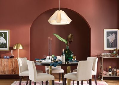
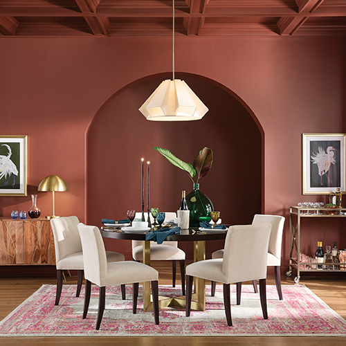
PPG/Glidden 2026 Color of the Year: Warm Mahogany
Bold, Grounded, Never Overpowering
Warm Mahogany is a rich red—not too bright, not too dark—that blends confidence with timeless appeal.
Why It Works in Commercial Spaces
-
Bold enough to make an impression
-
Neutral enough to work with modern interiors
-
Creates warmth without feeling loud
-
Adds personality to professional environments
Best Uses
-
Restaurants and lounges seeking intimate warmth
-
Retail spaces wanting a refined, earthy palette
-
Office entryways to create a sophisticated first impression
Emerald Inc.’s Tip: Use Warm Mahogany sparingly — it shines best as a controlled accent surrounded by neutrals.
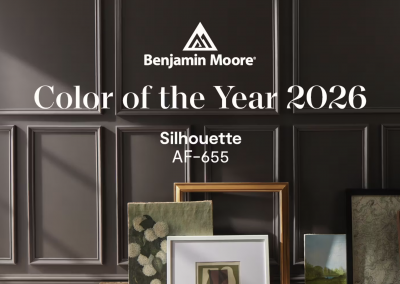
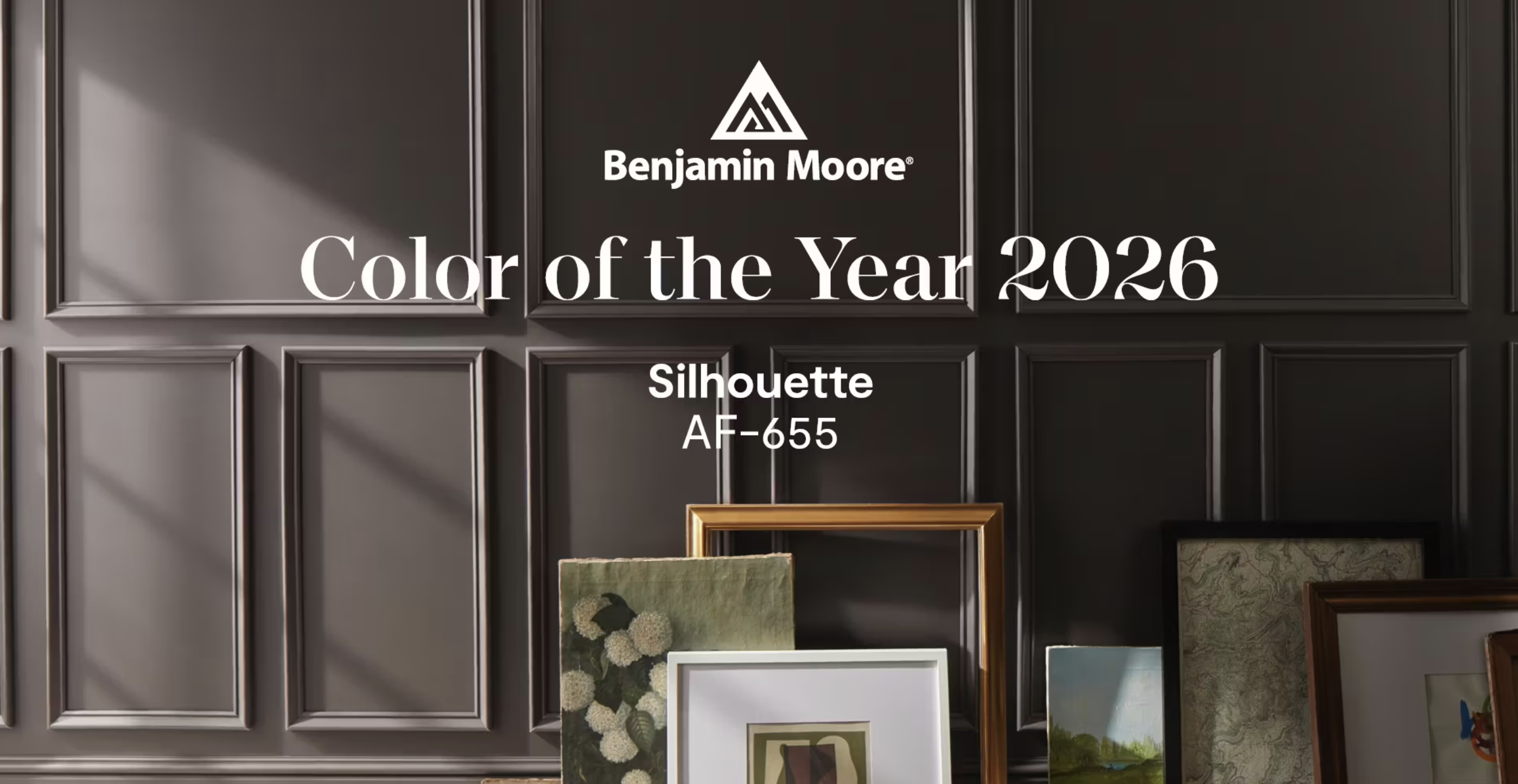
Benjamin Moore 2026 Color of the Year: Silhouette (AF-655)
Refined Elegance Meets Tailored Minimalism
Silhouette blends espresso browns with charcoal notes, bringing subtle luxury reminiscent of tailored suits.
Why It Works in Commercial Spaces
-
Creates a high-end, executive aesthetic
-
Adds depth and polish without feeling heavy
-
Ideal for modern office designs
Best Uses
-
Executive offices and conference rooms
-
High-end retail or luxury salons
-
Law firms, real estate offices, and financial institutions
Emerald Inc.’s Tip: Pair Silhouette with glass, steel, leather, and white oak for a corporate-modern look.
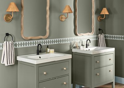
Valspar 2026 Color of the Year: Warm Eucalyptus (8004-28F)
Restorative, Serene, Nature-Inspired
Warm Eucalyptus blends burnt umber warmth with calming charcoal undertones — restful and grounding.
Why It Works in Commercial Spaces
-
Perfect for wellness-focused environments
-
Works beautifully with Arizona’s natural light
-
Creates a peaceful customer and employee experience
Best Uses
-
Medical, dental, and therapy offices
-
Spa and wellness centers
-
Any business wanting a serene, approachable vibe
Emerald Inc.’s Tip: Pair with Degas Blue or deep brown tones for a balanced natural palette.
Dunn-Edwards 2026 Color of the Year: Midnight Garden (DE5657)
Deep, Muted Green with Earthy Tranquility
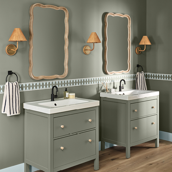
Midnight Garden is a lush, natural green inspired by moonlit gardens—calming, modern, and always flattering.
Why It Works in Commercial Spaces
-
Rich but not overpowering
-
Works on cabinetry, walls, or even exteriors
-
Universally appealing across industries
-
Adds sophistication and warmth simultaneously
Best Uses
-
Restaurants and cafés seeking natural warmth
-
Offices looking for a grounded palette
-
Retail stores wanting a refined boutique aesthetic
-
Interior accent walls in reception/lobbies
Emerald Inc.’s Tip: Use natural textures — rattan, clay tile, stone — to enhance its organic character.

How to Choose the Right Paint Colors for Your Business in 2026
Whether you’re remodeling a space or planning a new tenant improvement, consider:
1. Start with your brand identity
Do your colors evoke calm? Luxury? Energy? Professionalism?
2. Consider how customers should feel
Medical clients = soothed
Retail shoppers = energized
Dining guests = comfortable and warm
3. Factor in maintenance and durability
Darker colors hide wear better. Matte finishes show more scuffs.
4. Test colors in YOUR lighting
Arizona’s bright natural light can shift undertones dramatically.
5. Use the 60-30-10 rule
60% main color
30% complementary
10% accent
6. Check for city or plaza requirements
Historic districts and some landlords have color restrictions.
Ready to Transform Your Space? Emerald Inc. Can Help.
Emerald Inc. specializes in Arizona commercial tenant improvements — from design-build planning and layout optimization to full remodels. If you’re inspired by any of the 2026 Colors of the Year, our team can help you bring them to life in a way that enhances your brand, fits your budget, and supports your business goals.
📞 Call us at 480-832-9808
📧 Email us to schedule a free consultation
👉 Let’s design a space that keeps customers coming back.


