
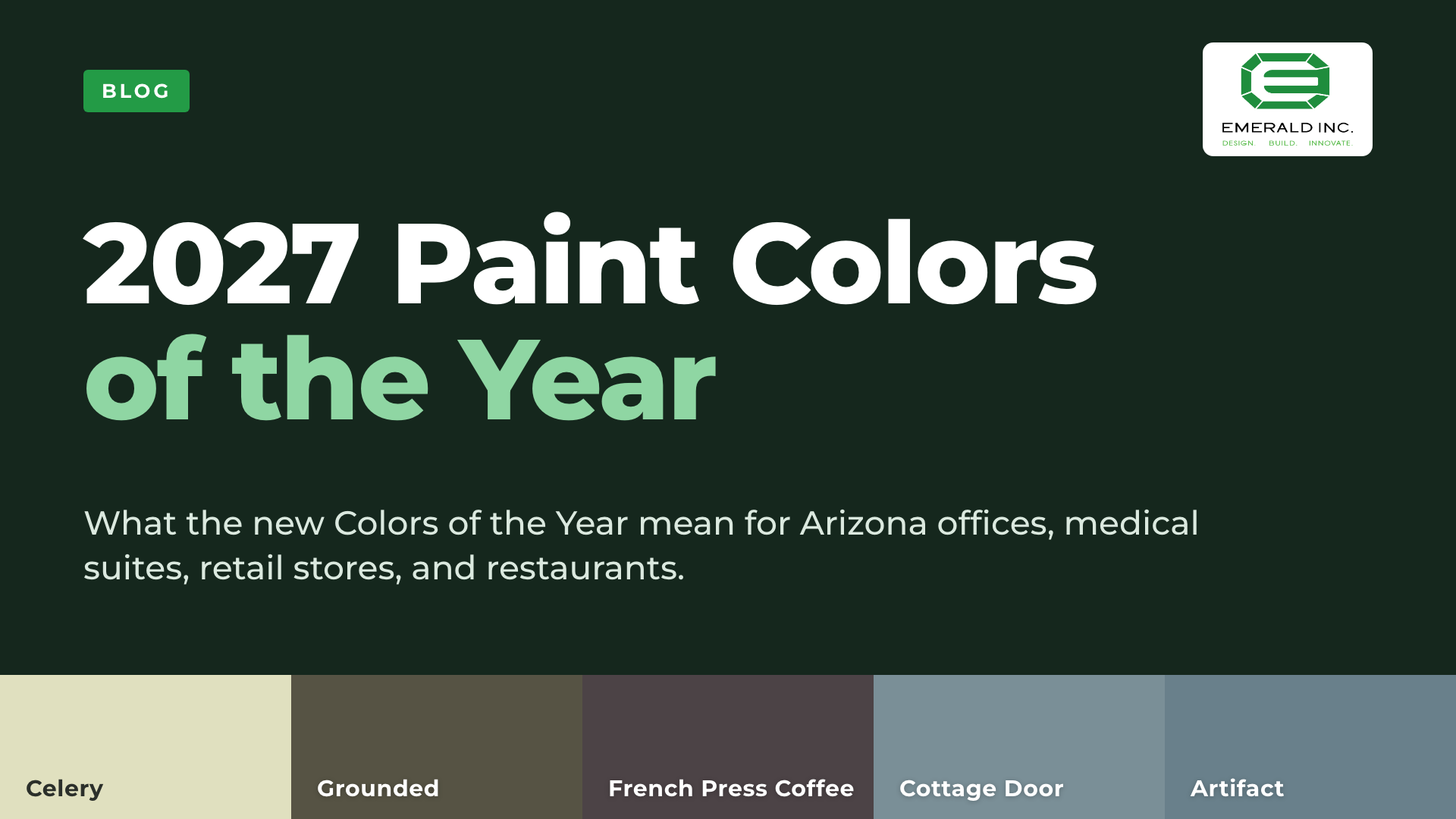
Five of the six major paint brands have named a 2027 Color of the Year, and they fall into two families: soft, nature-based greens and browns (Sherwin-Williams, Behr, Dunn-Edwards) and gray-blues (Valspar, PPG/Glidden). Benjamin Moore has said its reveal is coming this month, and we will add it here when it lands.
Most color-of-the-year posts stop at the swatch. This one lists each color with its paint code, then covers what matters when the space is a business: how each color reads in an office, medical suite, retail store, or restaurant, and what a color choice does to a tenant improvement budget and schedule.
Everything below is written for Arizona owners, brokers, property managers, and designers planning a tenant improvement (TI) or commercial remodel in the Phoenix metro.
The 2027 colors at a glance
| Brand | 2027 color | Code | Color family | Our read: where it fits |
|---|---|---|---|---|
| Sherwin-Williams | Celery | SW 6421 | Pale herbal green | Medical, dental, wellness, calm waiting areas |
| Behr | Grounded | T27-01 | Olive-moss green, brown undertone | Restaurants, cafes, boutique retail, office feature walls |
| Dunn-Edwards | French Press Coffee | DEBN07 | Deep brown, plum undertone | Restaurants, bars, retail feature walls, executive offices |
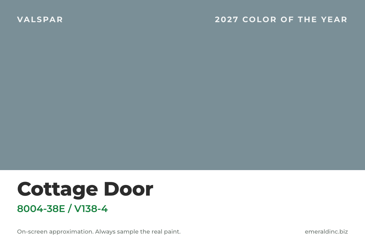
| Valspar | Cottage Door | 8004-38E (Lowe's) / V138-4 | Grayed blue, warm undertone | Offices, conference rooms, medical corridors |
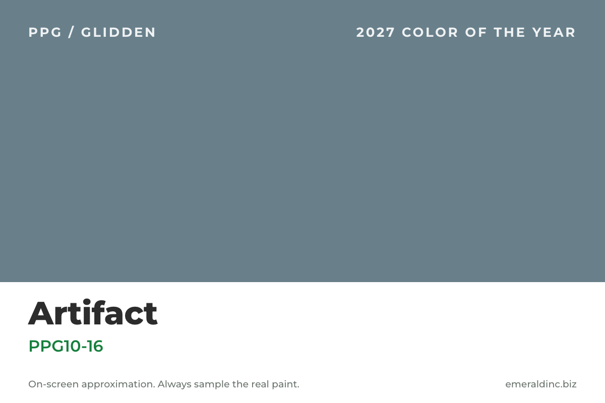
| PPG / Glidden | Artifact | PPG10-16 | Smoky blue-aqua | Dental and medical, offices, salons |
| Benjamin Moore | Announcement pending | Expected October 2026 | We will update this post |
Codes and descriptions come from each brand's own Color of the Year page as of October 2026. The swatches here are on-screen approximations only. Always sample the real paint on your own wall before you commit.
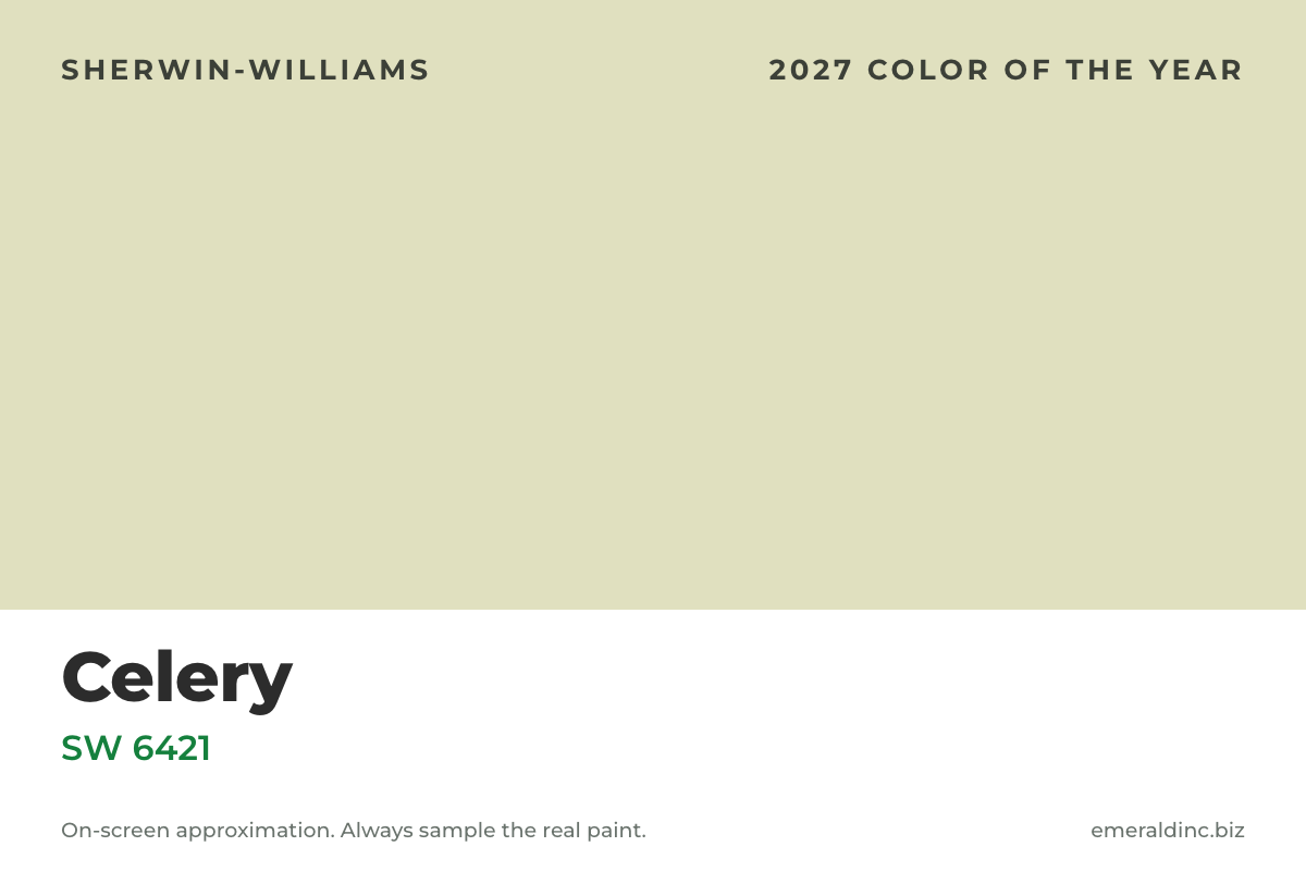
Sherwin-Williams 2027: Celery (SW 6421)
What it is
A light, airy herbal green with subtle yellow undertones. Sherwin-Williams positions it between an airy pastel and a grounded herbal tone.
How it plays in a commercial space
Because it is light, Celery can cover large wall areas without closing a room in, which is why it suits medical, dental, therapy, and wellness suites where the goal is calm without going dark. The yellow cast means it can read warmer or cooler depending on your lighting, so test it next to your actual ceiling tile, flooring, and fixtures. Sherwin-Williams lists White Flour (SW 7102) and Woven Wicker (SW 9104) among its coordinating colors for a soft, natural palette.
Emerald's tip: Light, warm greens are easy to like in a swatch and easy to get wrong under cool LED lighting. Check it at a few times of day with the light temperature your space will actually use.
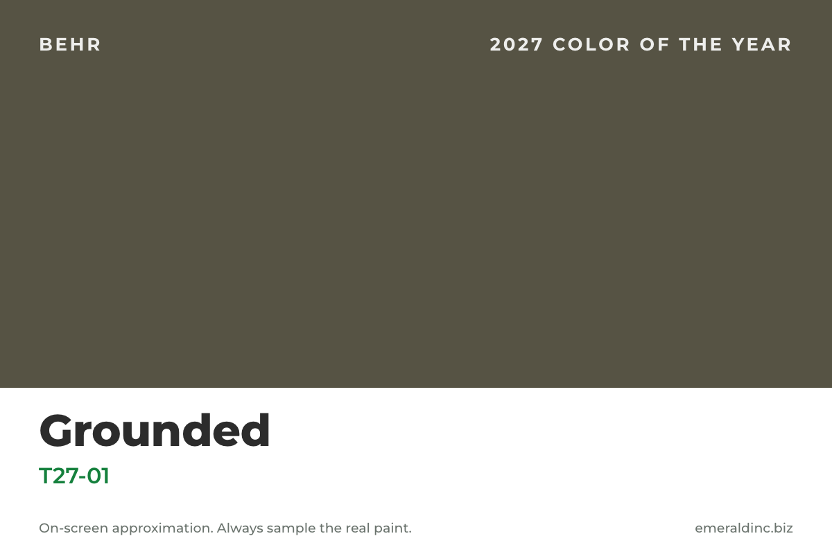
Behr 2027: Grounded (T27-01)
What it is
An earthy olive that sits between olive and moss, with brown undertones keeping it warm. It is a deep mid-tone green, and Behr lists it in its Dynasty, Marquee, Ultra, and Premium Plus lines.
How it plays in a commercial space
Grounded works best where a space wants warmth and a little drama: a restaurant or cafe dining room, a boutique retail feature wall, or a reception backdrop in an office. In a small room, a color this deep can feel enclosing, so it often does more as an accent wall or on cabinetry and doors than as a full-room color. Confirm which product line and sheen your painter will use for high-touch surfaces, since a color chip does not tell you how the finish will wear.
Emerald's tip: Pair it with natural wood, warm brass, or stone, and keep ceilings and trim light so the green has room to breathe.
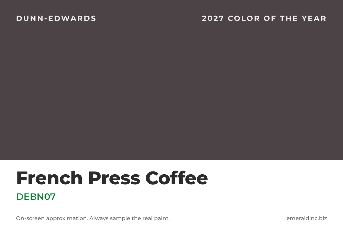
Dunn-Edwards 2027: French Press Coffee (DEBN07)
What it is
A deep brown with a subtle plum undertone, described by Dunn-Edwards as dark and atmospheric but restrained. Its coordinating colors include Hazelnut (DE6032) and Antique Paper (DE6218).
How it plays in a commercial space
Dunn-Edwards points to hospitality, workplace, and retail projects, and to intimate spaces where a deep color can wrap the whole room. That is where French Press Coffee fits: restaurant dining rooms, bars and lounges, executive offices, and retail feature walls. Very dark colors also change the work. They usually take extra coats and careful prep to cover evenly, and they make touch-ups more visible, so plan for both when you price and schedule the painting.
Emerald's tip: Use it where lighting is warm and the space is meant to feel intimate. Skip it in rooms that need to feel bright and clinical.
Valspar 2027: Cottage Door (8004-38E / V138-4)
What it is
A grayed-out blue with warm undertones. The code 8004-38E is the Lowe's version and V138-4 is the independent-retailer version. Valspar frames its 2027 palette as soft minimalism and lists Apricot Blush and Moon Shot as coordinating colors.
How it plays in a commercial space
A quiet, mid-tone blue like this is a reliable base for offices, conference rooms, and medical corridors, because it works with natural wood, light stone, and neutral flooring without competing with them. It is also easier to live with over time than a trend color you will want to repaint in two years.
Emerald's tip: Use Cottage Door as the base and let furniture, signage, or one accent color carry the personality.
PPG / Glidden 2027: Artifact (PPG10-16)
What it is
A smoky blue-aqua that PPG describes as a calm reset for a whole space. It comes with a nine-color trends palette, which includes Warm Mahogany (PPG1060-7), last year's PPG Color of the Year.
How it plays in a commercial space
Artifact is calm without being cold, which suits dental and medical suites, salons, and offices that want something more distinctive than white or gray. Because the trends palette carries over a color from last year, it is also one of the easier 2027 picks to combine with an accent you already have.
Emerald's tip: Try it on exam-room or treatment-room walls with white trim and warm wood, and keep corridors a lighter neutral.
Benjamin Moore 2027: announcement pending
Benjamin Moore has said it will reveal its Color of the Year and Color Trends 2027 in October 2026. We will add it to this guide, and to the table above, as soon as it is announced.
What a color choice does to a tenant improvement
Paint is one of the last trades on site, but the color decision is not a last-minute one. Four things make it a project decision, not just a design one.
1. Finish and cleanability
Color-of-the-year chips are shown on a swatch, not on a wall that gets bumped, wiped, and cleaned. For waiting rooms, exam rooms, restaurant dining rooms, and retail aisles, choose the product line and sheen for how the surface will be used, then confirm the color is available in that line. Ask your painter and your paint supplier, not just the color card.
2. Light changes everything
Arizona sun, storefront glass, and LED fixtures all shift how a color reads. Sample on the actual wall, at more than one time of day, next to the real flooring and ceiling. A color that looks right in a showroom can look different under your lights.
3. Depth and coverage
Deep colors like French Press Coffee and Grounded typically take extra coats and tighter prep than lighter ones. If you are choosing between a single accent wall and a full-room color, the painted area and the number of coats are what drive the labor. Our proposals are built by CSI division, so painting is its own line, which makes it easy to price an accent wall against a full-room color before you commit.
4. Landlords, leases, and timing
Some leases and work letters require landlord approval of paint colors or finishes, especially in multi-tenant buildings, so check before you order or design around a color. Settle colors and finishes on the finish schedule before painting starts. Changing a color after the walls are painted means repainting, and on a tight TI schedule that is real time and cost.
Quick guide by type of space
| If your space is... | Worth a look | Why |
|---|---|---|
| Medical or dental | Celery, Cottage Door, Artifact | Calm, lighter mid-tones that support a clinical but welcoming feel |
| Office | Cottage Door, Artifact, Grounded as a feature wall | Quiet base colors with one stronger accent |
| Retail | French Press Coffee or Grounded on a feature wall | Depth behind displays, with neutrals elsewhere |
| Restaurant or bar | French Press Coffee, Grounded | Warm, intimate dining-room color |
| Warehouse or industrial | Any of these as an office or entry accent only | Keep the working areas simple and durable |
See paint on real Arizona projects
Color looks different once it is on the wall. Our project updates show paint going into medical, retail, and food-service spaces: Solace Pediatric Healthcare in Tempe, Ruby Bloom Boutique in Queen Creek, and Mama Linda's Bakery. You can also browse our medical, retail, and restaurant project galleries.
Frequently asked questions
What are the 2027 Paint Colors of the Year?
Sherwin-Williams named Celery (SW 6421), Behr named Grounded (T27-01), Dunn-Edwards named French Press Coffee (DEBN07), Valspar named Cottage Door (8004-38E at Lowe's, V138-4 at independent retailers), and PPG/Glidden named Artifact (PPG10-16). Benjamin Moore has said it will announce its 2027 color in October 2026.
Should a business use a Color of the Year?
Often as an accent, rarely as the whole palette. A trend color on one feature wall, over a calm neutral base, gives you a current look and a cheap repaint when the trend moves on. Choose for your brand and your customers first, then check that the color works in your lighting and finish.
Do I need landlord approval to paint my tenant space?
Some leases and work letters require it, especially in multi-tenant buildings. Check your lease and work letter before you finalize colors, and get approval in writing if it is required.
When should I choose paint colors in a tenant improvement project?
Before painting starts, and ideally when the finish schedule is set. Changing a color after the walls are painted means repainting, which adds cost and can delay the schedule.
Will dark colors cost more to paint?
They often take more labor, because deep colors usually need extra coats and careful prep to cover evenly. The cost depends on the area, the surface, and the product, so ask for painting priced as its own line and compare an accent wall with a full-room color.
Planning a tenant improvement in Arizona?
If you are weighing colors for an office, medical suite, retail store, or restaurant, Emerald Inc. manages commercial tenant improvements across the Phoenix metro from permit through punch list, including the finish decisions that keep a schedule on track. Learn more about our tenant improvement work, office, medical and dental, retail, and restaurant construction, or tell us about your project below.
Looking for last year's picks? See our 2026 Paint Colors of the Year guide.
Ready to Transform Your Space?
Tell us about your project. We’ll review the details and give you a clear, itemized
estimate — no obligation.